Hello reader! Welcome to my first blog post.
On today’s topic, I’ll be showing you my journey on how I made the illustration for Elise Kova’s 3rd installment of the Air Awakens series; Earth’s End.
I’ll be covering the initial stages in depth, from thumbnails, artistic insights to design problems and finally to the finished painting.
Are you excited? Me too! Let’s get to it!
Idea Generation
The one thing we all dread at times is how to come up with ideas. Where do we even begin? I suppose to most artists this part is usually not a problem since creativity tends to just start flowing once we start and get really into it. With Elise’s series it was much easier because the story was already laid out in the open for me to interpret (Elise sends initial manuscript and excerpts for me to read and interpret as I go). But for the most part, sometimes we just get stuck and don’t know what direction to go for. With that said, the initial problem I encountered with this project was proper visualization and relevance.
There are questions that roam my mind during idea generation stage. How do I make sure the cover stays relevant to the story without giving away too much content, along with random ones and others like; what easter eggs should I put in that the readers could go back to notice and enjoy in the cover? What is the mood I’m going to portray? Do I pick out specific scenes or do I go with the abstract route? Etc. These type of questions usually guide me into conceptual thinking.
Thumbnails
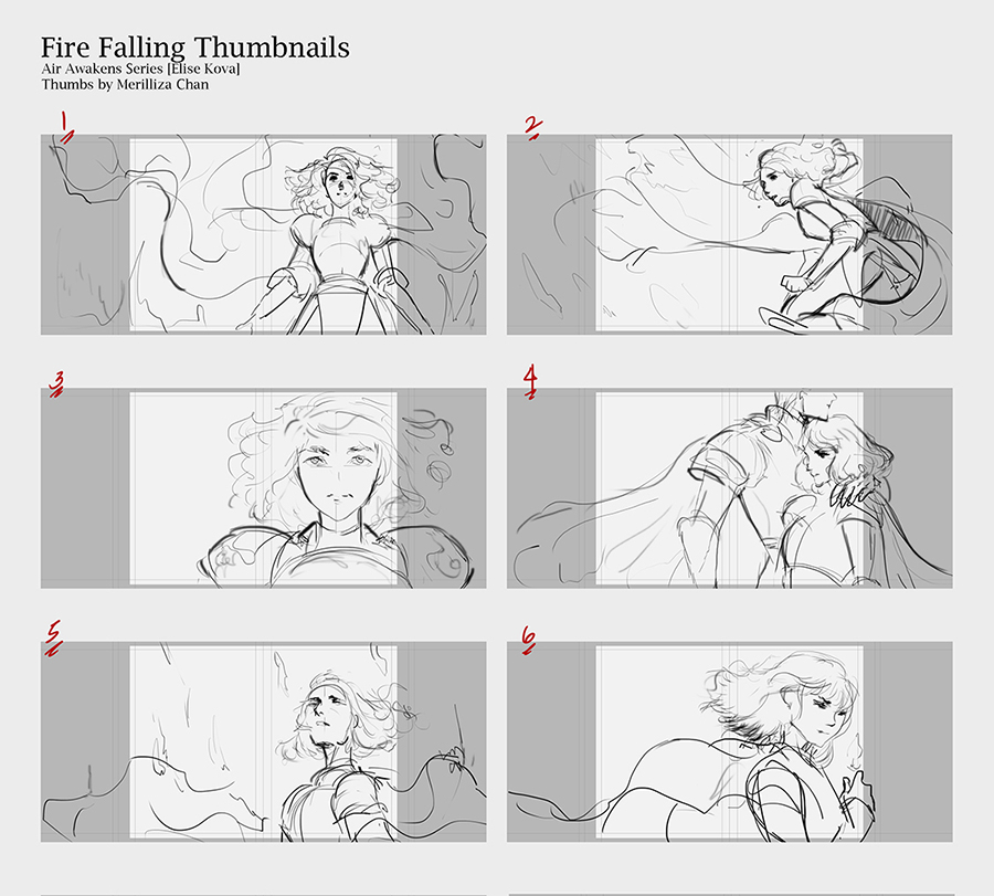
Thumbnails in general is a fun part for me. It’s like juggling with the many possibilities and scenarios in the story and envisioning them through very simple drawings where I don’t need to worry too much about technicalities and problem solving.
(Earth’s End initial thumbnails. There’s usually huge blocks of texts below each thumbnail to help my client understand the idea, but for this post I removed it because they indicate a lot of spoilers for the book.)
My thumbnails are usually way messier than this. The type that only I could make sense of what’s actually going on. They normally involve a lot of circle and square shapes. I usually make plenty of the initial scribbles on a scratch of paper (ones that look quite disposable) and then choose the few ones that I liked and transfer them digitally, just to make them a little more readable. There are times I go straight digital when a pen and paper isn’t in sight.
(The old thumbnails for Book 1 and 2, Air Awakens and Fire Falling)
So with every cover that I’ve done for Elise, as well as any illustration in general, I always start with thumbnails to get the initial ideas set out, while still trying to keep in mind the many questions I’ve mentioned above. It’s important to note that in this process I don’t really pay attention to how pretty and well done any of the elements are, just that thought of wanting to put everything down on paper before it gets lost in the abyss of my mind. Though I do make sure that the main elements are somewhat readable, since well, a client is going to look through them.
Preliminary Painting Studies and Reference Gathering
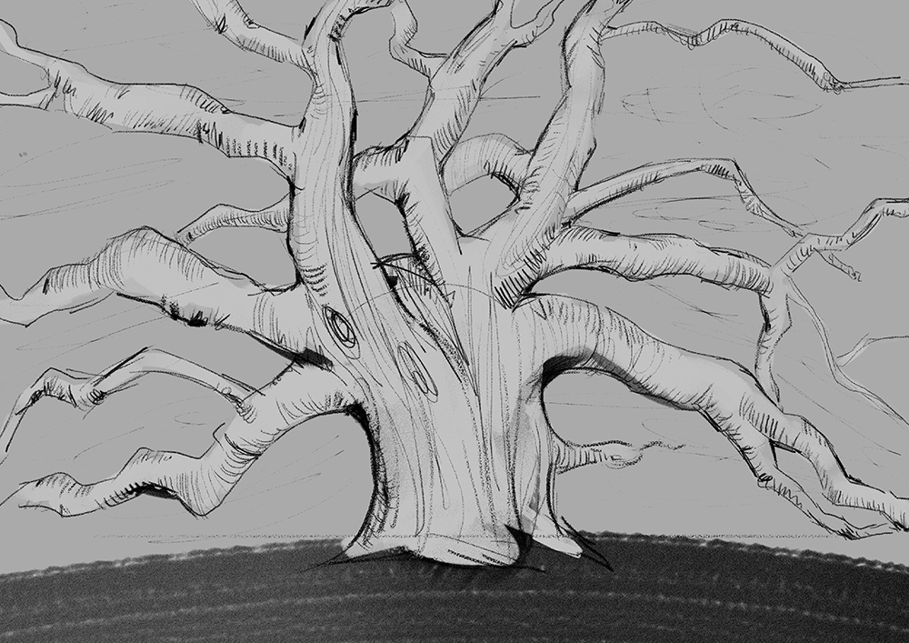
Before I go venturing into the unknown, I want to make sure I’m prepared for the journey. So I did some studies to warm up that artsy area of my brain in the hopes of increasing my chances of actually not screwing up. That, and basically trying to understand trees and forest scenery.
(Quick studies done with a standard round brush for the drawing and a rectangular brush for the quick paintings. Each took about 15-20 minutes.)
While I waited for Elise to choose a suitable idea, I went and gathered a lot of other forest references. As well as illustrations from various artists I deeply admire. Inspiring illustrations that I think will be relevant to how I’ll go about with this piece. I also have a reference board to help me organize and put everything in place. (There's a program I use called refBoard).
Final Sketch
Unlike the previous 2 book covers, Elise easily picked one out from the thumbs that was inspired by a prominent scenario from book 3. (I’m not going to go into details since I may accidentally spurt out some spoilers and her fans will hate me forever.)
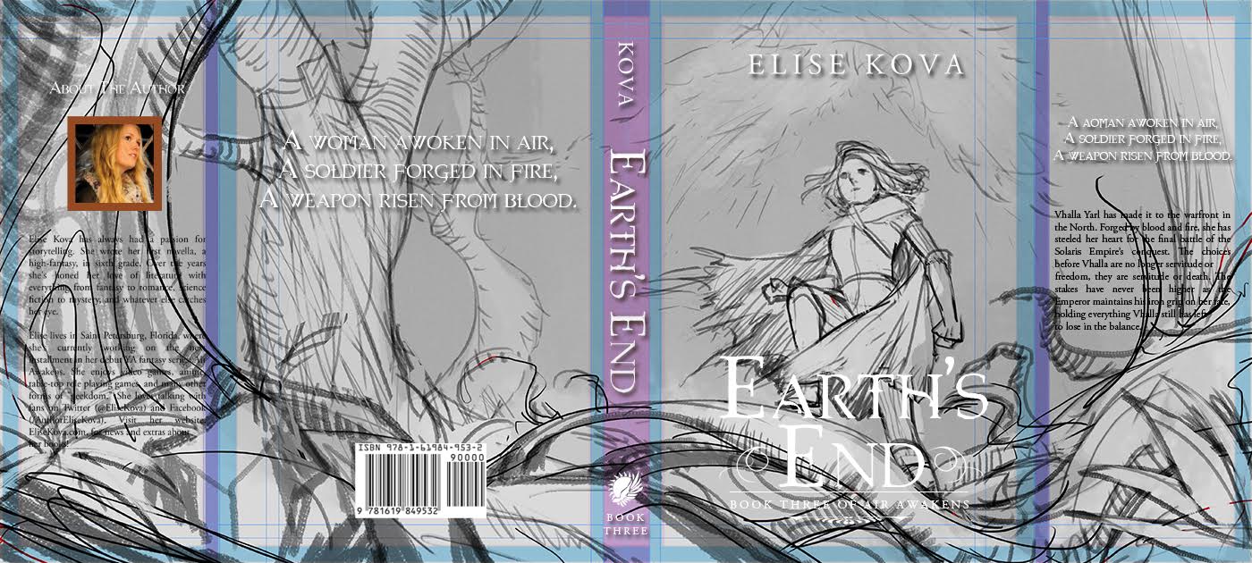
And behold the sketch!
Yes I know it’s not great. Many other artists will usually have a tight sketch because it helps them figure those details out first so they wouldn’t worry about it later. (And not just details but other design problems like perspective). I tend to go in the middle ground as I’ve discovered that no matter what specific detail I put into the initial sketch they would always somehow change in the end. So I found that it saves me more time to worry about those in the later painting stage.
I’m not saying that is going to be my process for eternity. I think it’s good to train yourself into decisiveness and stick to what you originally designed, something I would really like to explore more myself I admit, but for now I like to remain “free” when painting, that is moderate details with the general shapes included.
(These are the quick layout mockup for the soft and hardcover that Elise sent me. Seeing these make me very excited to finish the actual cover.)
Color Comp and Painting
We finally get to the painting process stage. This stage may or may not bore you, to me this is the part where I come across many different problematic areas and I try to solve them at best of my current artistic knowledge, as well as the minute tricks I learned from my preliminary studies. Without any Art Director to aid me, I found myself sometimes completely lost and not knowing what to do or how to solve a problem. We’ll get to that very soon.
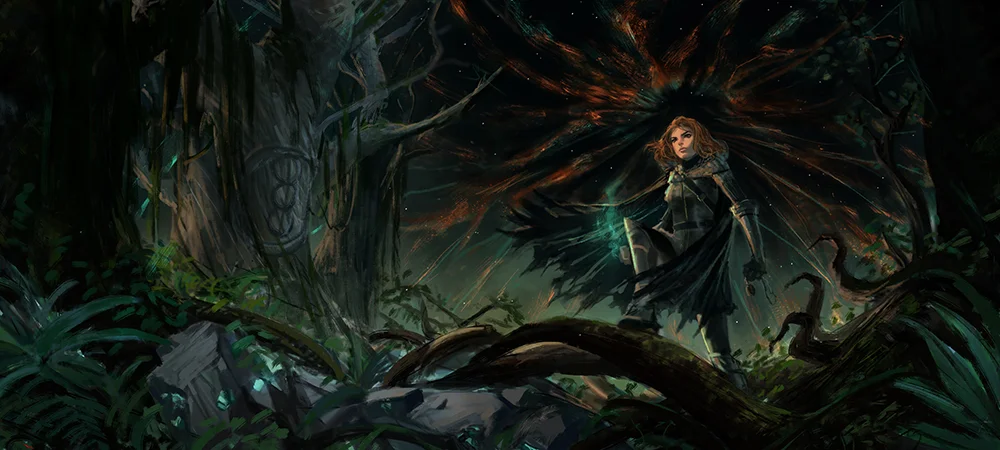
The scene took place in a night setting and I wanted to portray the heavy forest of the North in Elise’s story. Perhaps this is the outskirts of the forest when Vhalla (The protagonist) first took a step on it.
When Elise picked that thumbnail I already had in mind what kind of mood to go for. I tried to think in temperature and contrast. I wanted the background to be generally colder with the character illuminated with warm light to make her stand out.
To balance it out, I put indications of warm light surrounding the forest scene. Generally I picked this scene out from a starting point of a battle scenario. Although it doesn’t really show that, the warm glow from behind the foliage highlighting the trees indicates a hidden lightsource. Perhaps there’s firey things going on there somewhere? The warm light is also indicative of the “firebird”.
Elise chose this idea to emphasize Vhalla’s growth throughout the series so we wanted to make it grand and the “firebird” was the symbolism for that, a main thing we wanted show on the cover.
But wait Meril, what firebird? I don’t see any “firebird”!
Well, you maybe right.
The Dilemma
Above shows the supposedly final painting draft I wanted the cover to have. I didn’t want to go overboard with the firebird design, instead I wanted to paint it “realistically”, a visage to how I would see it in the night sky perhaps.
In my mind, it wouldn’t look exactly like a literal bird, much like how you’d look at a cloud and see shapes that are not really there, the phenomenon called Pareidolia. I didn’t want it to be too powerful that it would ‘hide’ the character from the ‘view’ because as much as possible I wanted the eye to focus on the protagonist.
But alas, revisions had to happen. I understood exactly the problem and why it was a problem as she showed me what she had in mind, attached below. I wouldn’t have realized without someone pointing it out. And I honestly thought it was great. I loved the contrast the oranges made against the dark blue green sky. How could I not have thought of that first? So perhaps there was another way to go about this.
(Elise sent me this quick draft of the firebird she had in mind.)
To solve this predicament I did many experiments on it. (Ones that I never got the chance to take progress shots of because they were very quick experiments). I kept going, combining different layers, playing around on layer modes, removing and adding paint layers. Etc. And arrive to the conclusion that intense fire is harder to paint than I thought.
After a considerably good amount of minutes to hours, I was finally feeling it. The ‘Yes!’ moment. It was coming together. Naturally I had to change major lightings and paint over some more parts on the character. Sent it off and got it approved. Finally I did some more painting, cleaning and polishing until I felt I finally had to leave it alone.
The Final Painting of Earth’s End
Final Thoughts
Overall I feel quite happy and contented with how it turned out. While there were things that were lost and parts I wish I could have done better, Elise was happy with it and that’s what matters to me. On top of that, I think this is one of those paintings that felt a big deal to me. I learned a lot from it and I truly enjoyed painting it especially.
On some ending note, I mentioned before about not having an Art Director because Elise is a self-publishing author. To the readers who are curious how I go about this, well it’s probably like making personal paintings. I relied mainly Elise’s feedback and she helped greatly on this one, as well as my close trusted friends, who are also artists, to look over the initial stages of painting. Their feedback is the most helpful and I truly value the littlest comments. Other than that, a lot of reference materials to help me maintain the painting.
Despite dropping some insights here and there on this post, I am aware that my art is far from perfection and I’m honestly not great yet in the grand scheme of artistic skills, but I still hope you liked this post, perhaps picked up a thing or two. If so I’m very glad!
--
What do you think? I’m very curious with what you have to say as well. Did you like the final artwork? Would you like me to post more of this? Did you think it was too long? Is there any more you’d like to hear about book illustration that I missed? Maybe you’d like to share your journey as well. Any thoughts in general would be nice to hear!
Thank you so much for your time reading my little journey with this artwork. I know blogs are somewhat “yesterday” as youngsters might say and I feel still feel like I missed a lot of important subjects despite such a long post, but I think it’s most valuable and interesting for people to know what artists actually go through before seeing the finished product of art that people only ever get to appreciate.
Again please feel free to leave a comment. I’m hoping to do more of this in the future.
Until then!
Meril
---
Earth’s End is the third installment of the Air Awakens series © Elise Kova (www.elisekova.com)
Artwork is done by me, Merilliza Chan (www.merilliza.com)
Earth’s End is available as print at my Inprnt Store.


